To enable sustainable clothing manufacturing for a medium-sized company by attracting web visitors’ attention to buy new collections.
This was a UX audit for a clothing brand planning to strengthen its digital presence and raise the eCommerce conversion by 1.5x to maintain its new sustainable manufacturing.
I found many opportunities through surveys and web analytics data, which I and other stakeholders prioritized according to value and urgency.
I overcame a low-budget, massive redesign by gathering feedback from collaborators and directing myself through usability, accessibility, and conversion.
After that, the company set an A/B test to confirm which of the two chosen redesigns would bring the highest conversion.


Why they were buying?
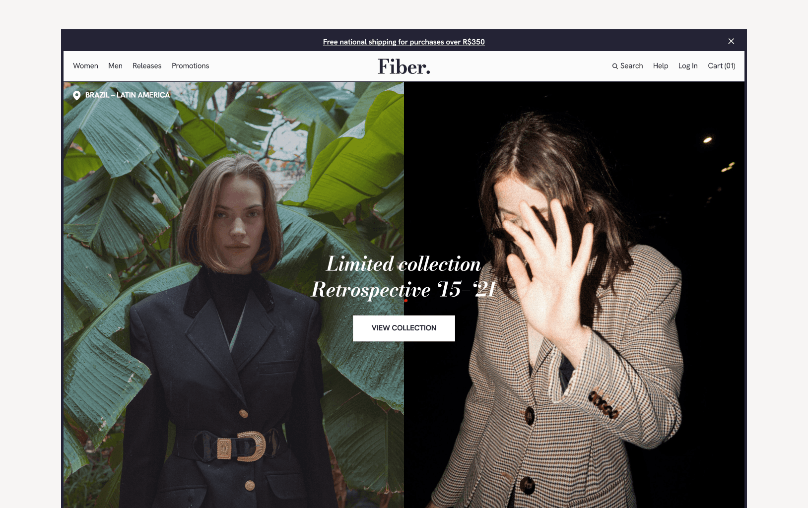
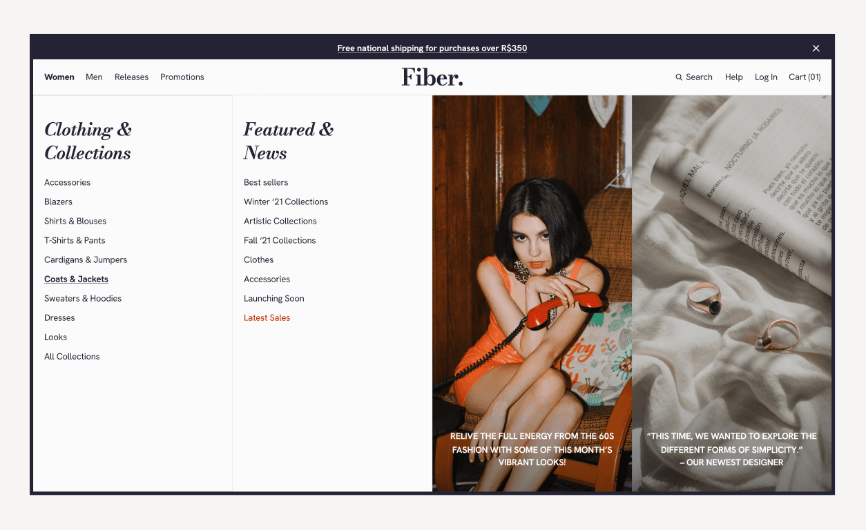
73% of the Fiber’s global sales were from physical stores, so its website was a neglected channel with little in-depth research.
With fragments about the users and why they were buying, which could differ from store buyers, I collected data from post-purchase surveys and web analytics with Hotjar, GTM and GA4.


PRIORITIZATION & chALLENGES
Then, I delivered my insights to stakeholders to consider their feasibility and prioritize the outstanding ones based on Effort x Value and, to sort the backlog, Importance x Urgency matrix.
However, their enormous investment in manufacturing left me with a big challenge after that collaboration—a small budget for many changes to test.
I and some collaborators from the back/front-end, SEO, and Customer Support team had to put ourselves in the visitors’ shoes, and it was risky.


DESIGNING FOR CONVERSION
To maintain a clear direction on wireframing the customer journey, we had to stick to three crucial factors: navigation, usability, and conversion.
“Where do they desire to go? What could prevent or frustrate them from getting there? What would drive their purchase decision at each step?”


A dilemma to solve
After weeks, I and other stakeholders concluded two of my redesigns would be better adopted because of their similarities to the current website and the focus on what users sought.
To conclude which version had the highest conversion, they set a 95% margin of error A/B test for a month on the website to leverage its user traffic and reduce costs from recruiting users for quantitative research.
THE RESULT & NEXT STEPS
Not only did the B version have a 19% higher conversion than the A layout (2,27x more than the current eCommerce), but visitors were also more likely to explore other products.

But why? The hypothesis was that the B version was straight and highlighted the products’ variety and quality, while the A version was more similar to the existing design and had too much visual clutter and a longer checkout.
Fiber’s next steps would be to review the long backlog to consider meaningful UX implementations and optimize the website to build a strong brand-customer relationship.